BRANDING, WEBSITE AND DIGITAL ADAPTATIONS
EN
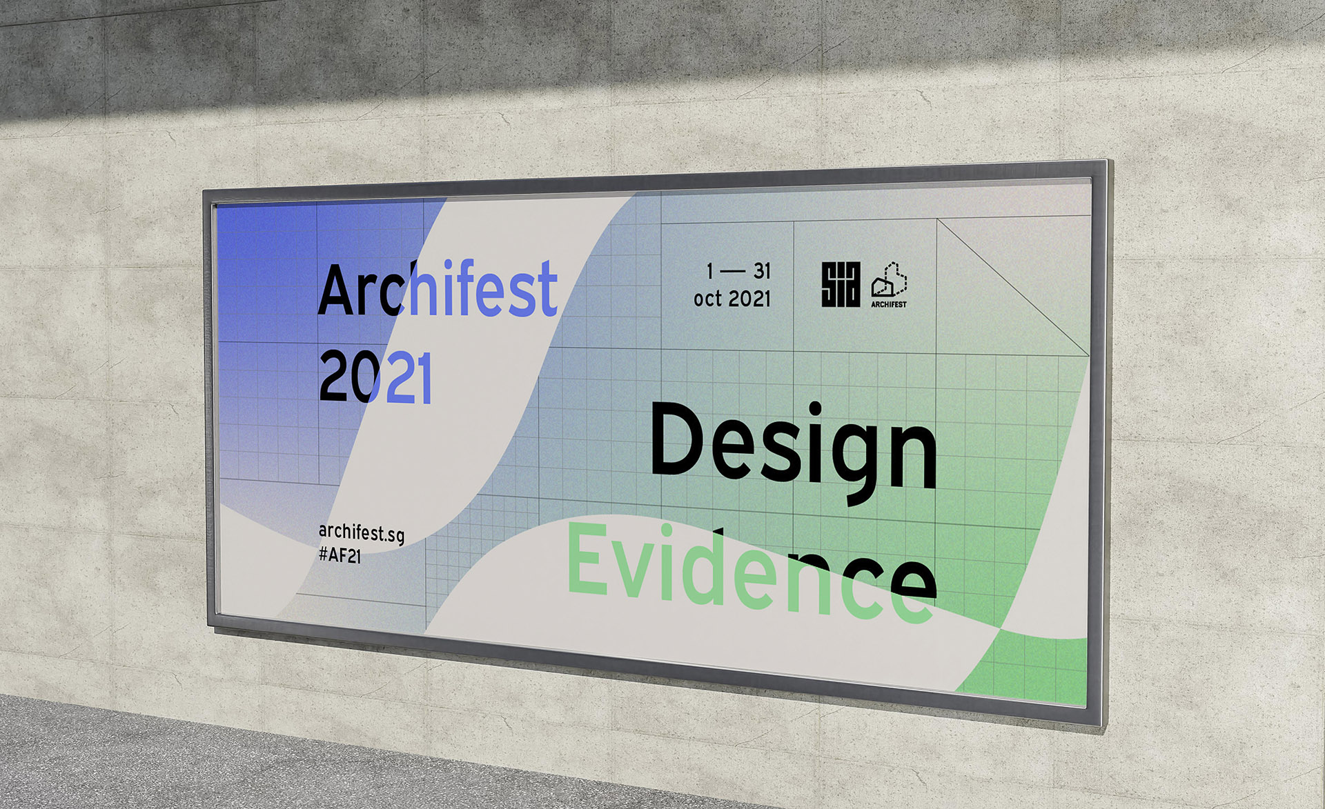
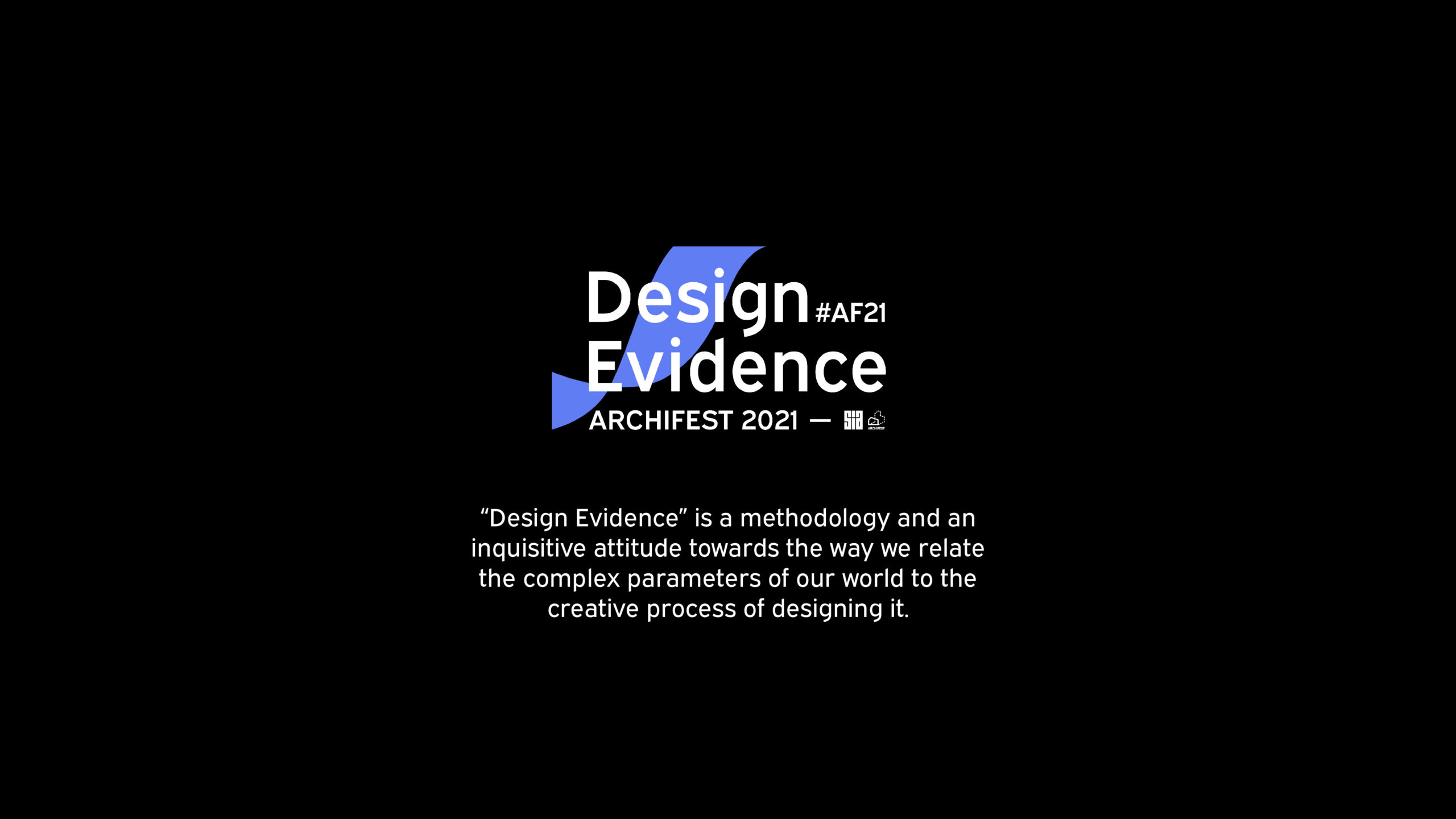
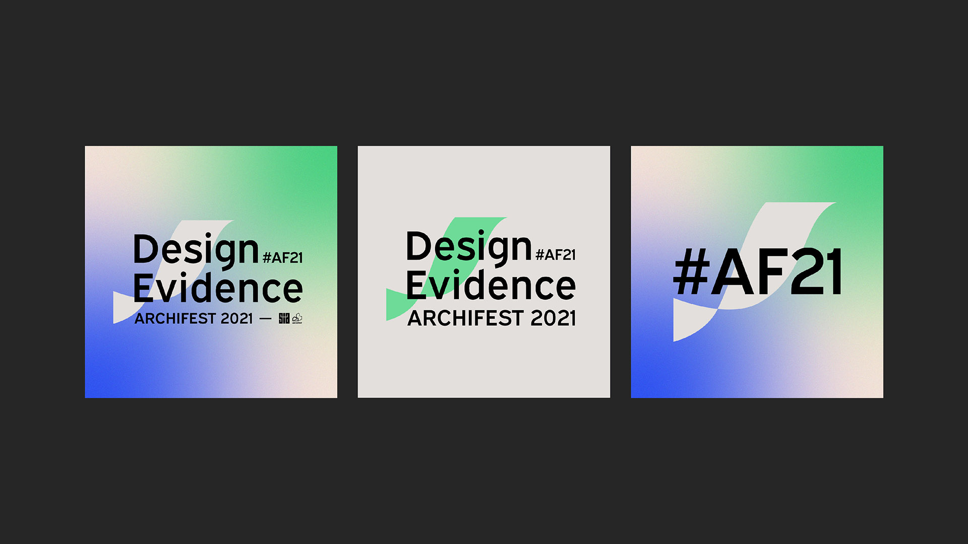
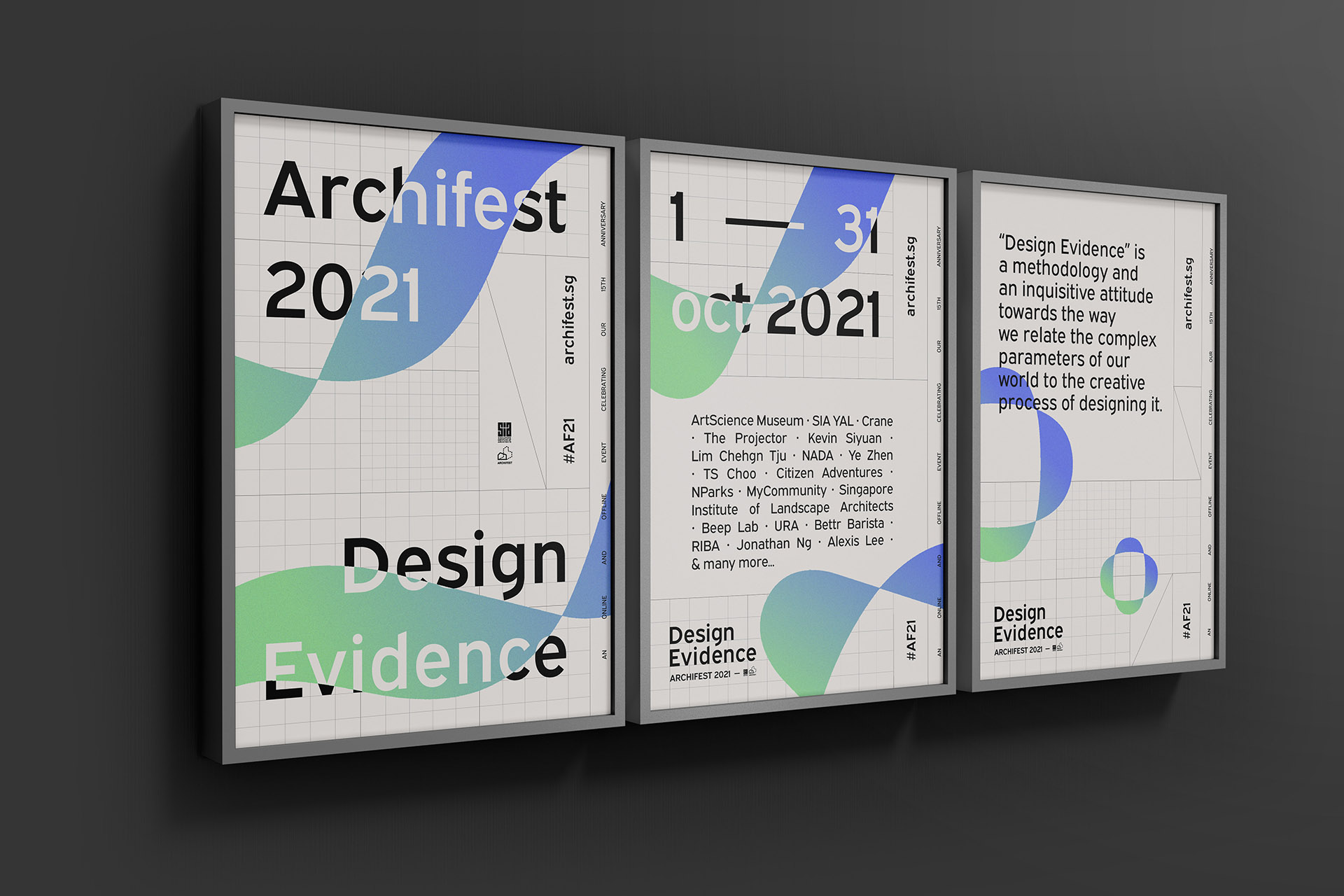
Design of the branding of the 2021 Singapore annual Architecture Festival, Archifest. This online edition of #AF21 was under the theme ‘Design Evidence’.
“Design Evidence is an invitation to debate, discover and redefine what architecture could be. We believe that bringing together a diversity of voices is a step towards a more inclusive dialogue. 2021 is a fresh chance to promote architecture and design to a broad community of passionate individuals and the greater public.We have built tremendous resilience over the past 12 months and I strongly believe that our local, regional and global audiences are ready to take virtual and physical engagements to the next level, and why not – have some good fun with it.” Archifest Commitee
Art direction, design of the branding, social media templates, posters and digital adaptations, design of the pre-launch micro-site and co-design of the final website.
Done at OuterEdit
Creative Direction: Ryan Tan
Strategy: Ryan Tan, Jane Chang, April Luistro
Art Direction: Leslie Guidez
Branding and collateral design: Leslie Guidez, April Luistro, Pamela Ang
Animation: Marilyn Neo
Website design: April Luistro, Charmaine Yeo, Leslie Guidez
Web development: SMMMILE
Content creation and roll-out: Archifest team & volunteers
Singapore, 2021
FR
Design de l’identité de marque du Festival Annuel d’Architecture de Singapour, édition 2021, Archifest.
Cet édition #AF21 était sous le thème ‘Design Evidence’.
Direction artistique, design de l’identité, des gabarits réseaux sociaux, posters et autres adaptations digitales, design du micro-site pré-lancement, et design collaboratif du site internet final.
Réalisé à OuterEdit, Singapour, 2021
Client
Archifest, Singapore Institute of Architects
We wanted to introduce Archifest in a new light, bringing a sense of dynamism to the brand while anchoring on the AF’s principles of inclusivity and being accessible to broader communities.
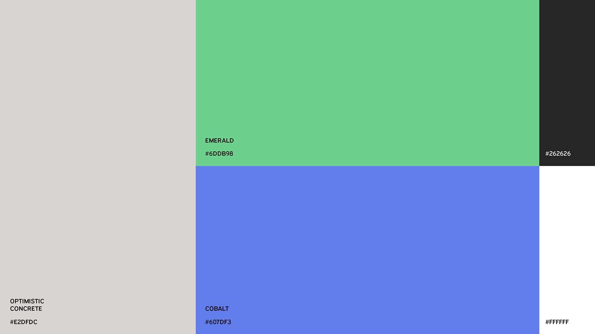
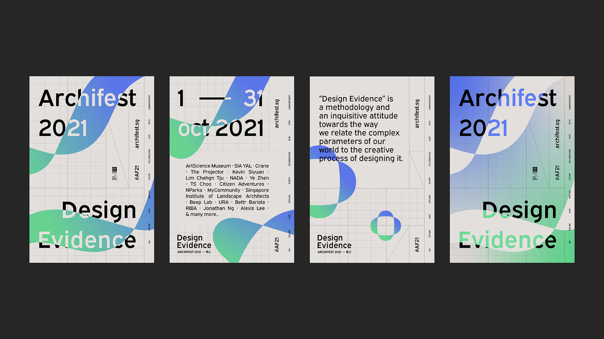
GREEN AND BLUE
We introduced a refreshed colour palette inspired by the environmental elements of Singapore’s nature and landscape surrounding its architecture, brought together through a gradient combination that interacts spiritedly, evoking a sense of excitement and optimism.
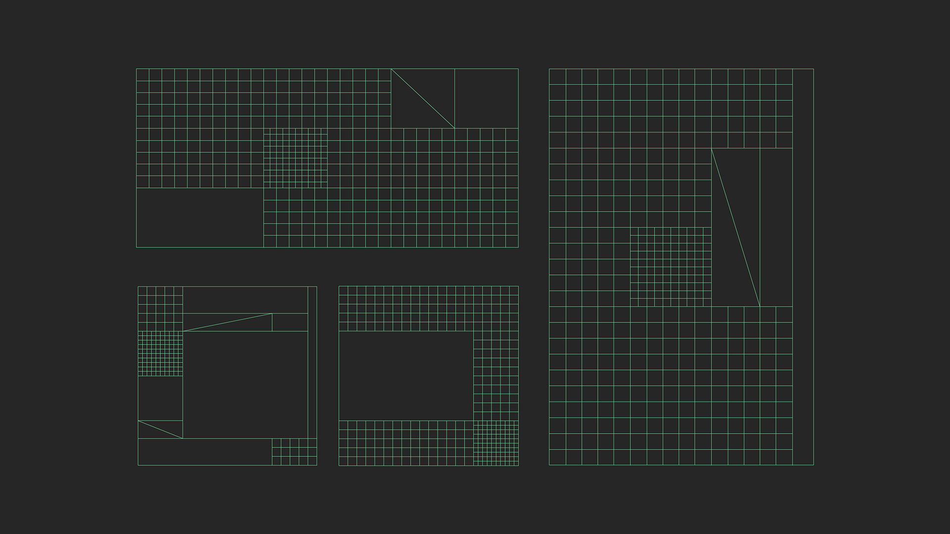
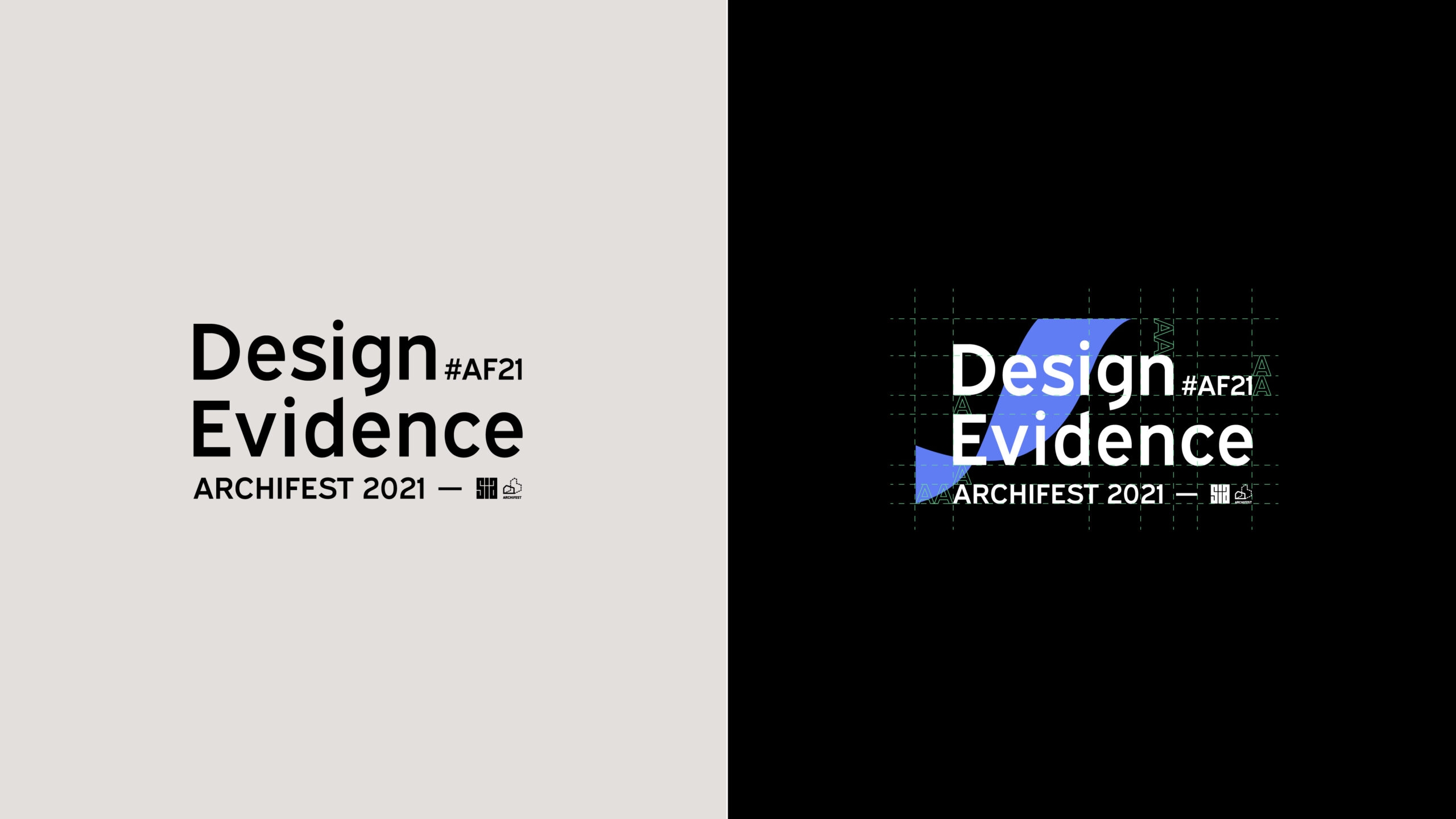
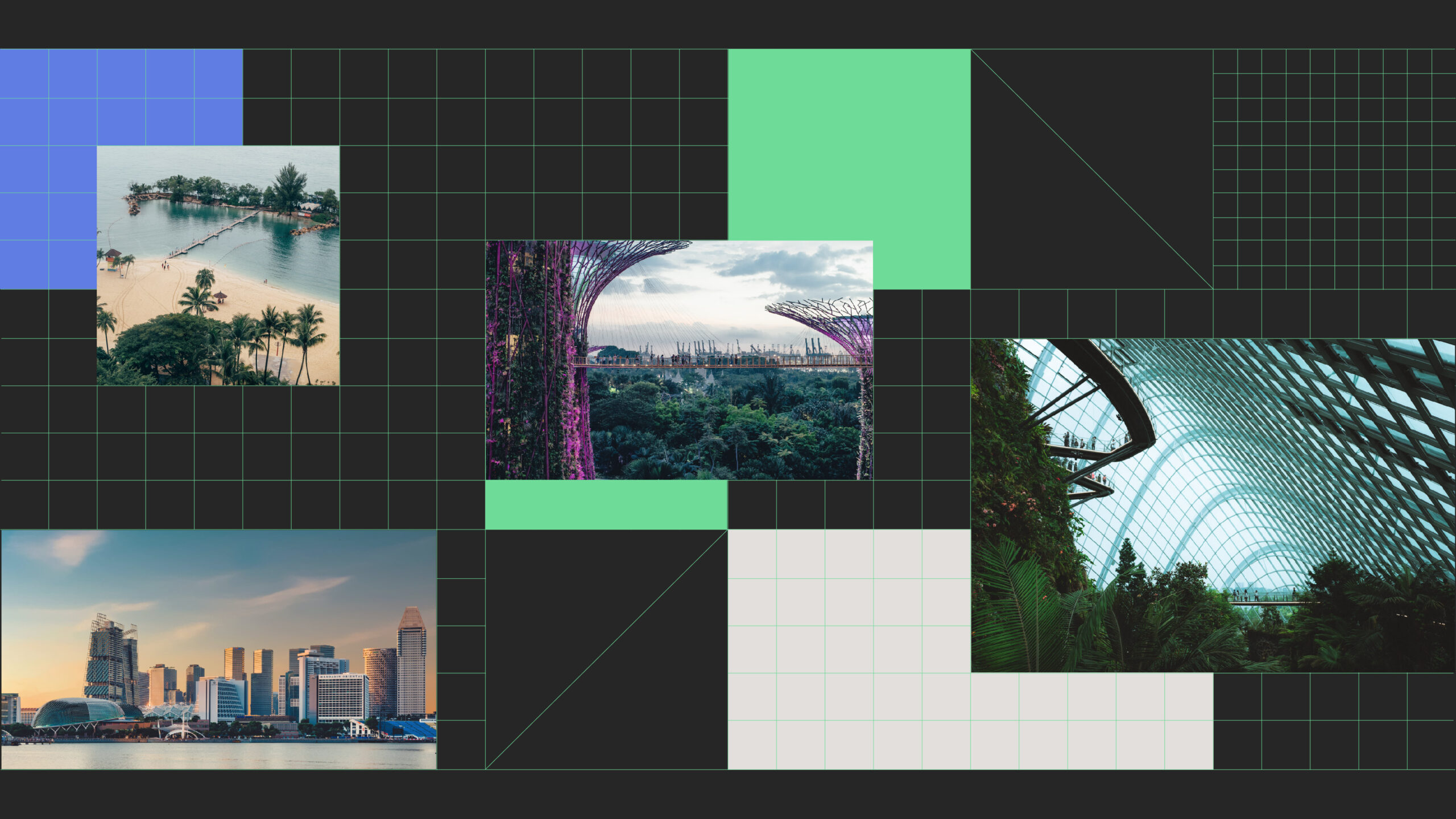
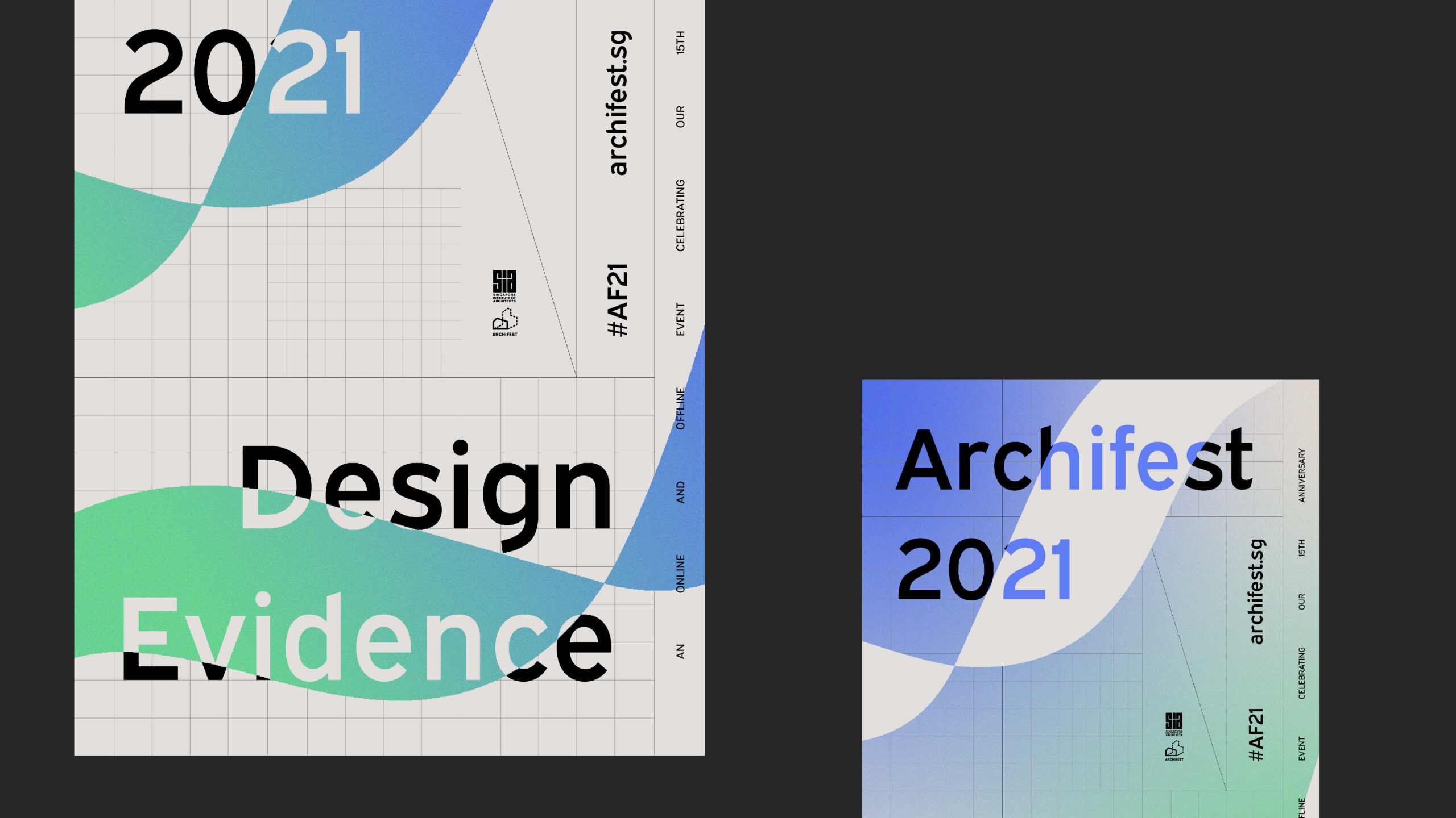
THE GRID
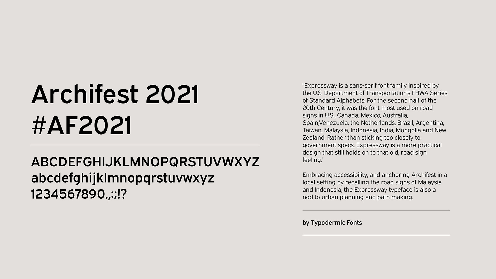
Inspired by an architect’s workspace, a subtle grid system provides the foundation for content, allowing elements to be purposefully placed for optimal visibility. Clean typographic elements with clear hierarchy also keep the information accessible yet dynamic as they take up different spots within the space.
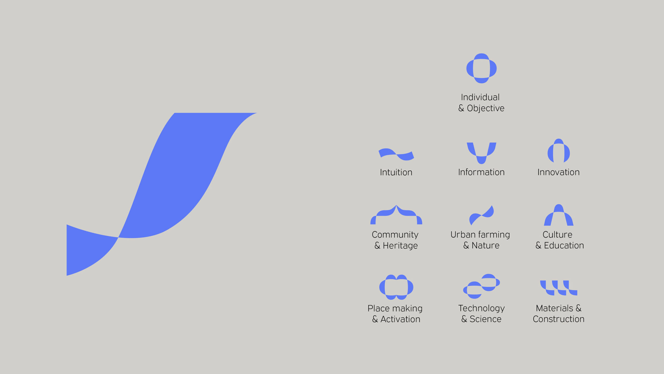
THE RIBBON
A key element within the identity is an unfolding ribbon, weaving through the typography and grid, revealing hidden corners and unveiling information to encapsulate the act of uncovering and discovering evidence.

Archifest celebrates the architecture in our lives and this identity makes an optimistic and strong statement, paving the way for an evolved festival experience into a hybrid realm for the years to come.
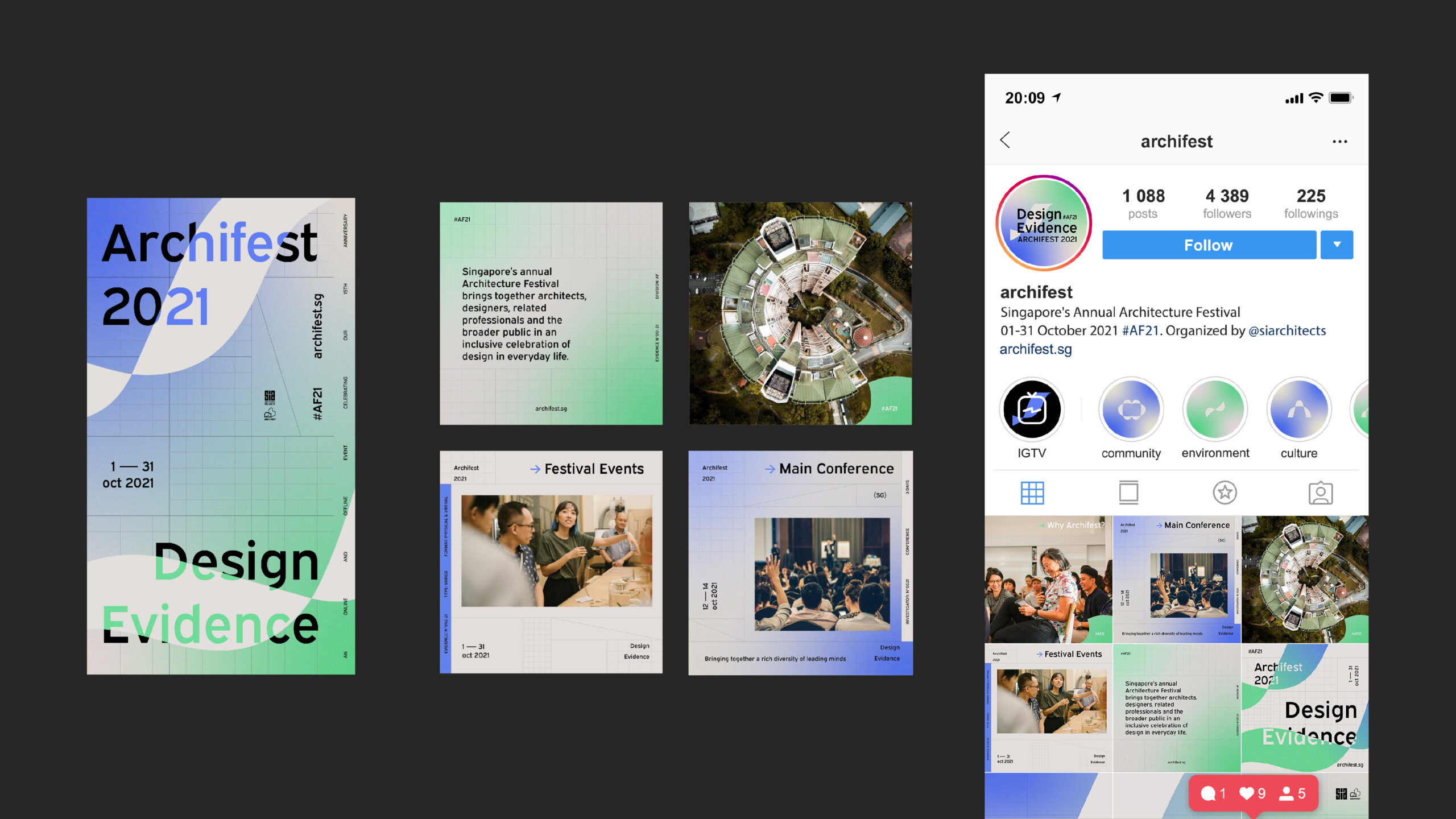
DIGITAL NATIVE
Our take on a hybrid festival transcends physical activations and installations, into a seamless experience for the digital natives. We developed a flexible visual system for the identity – one that lends itself well to various formats of online executions while keeping the identity fresh at every touch-point.

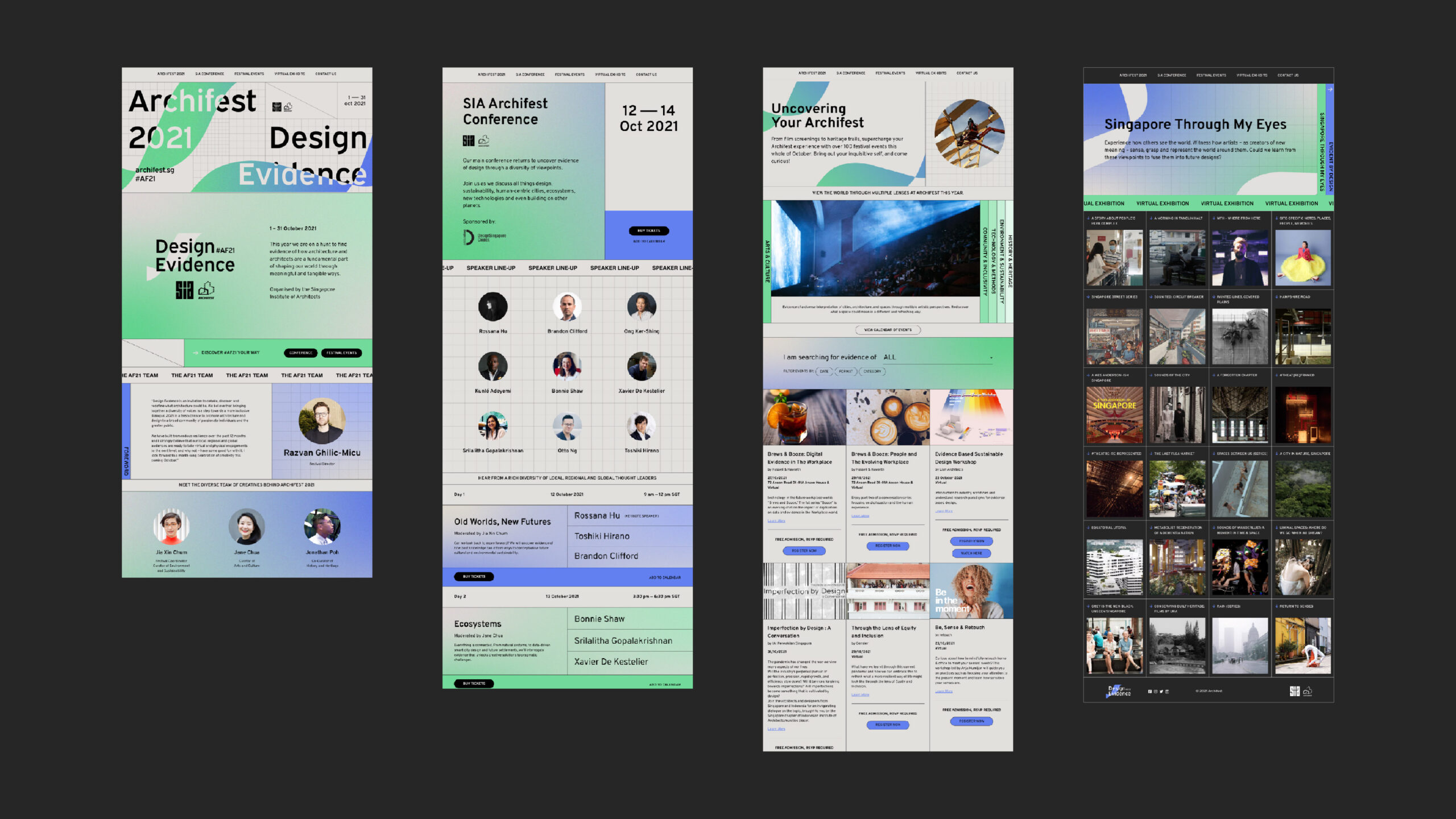

Microsite